
 Forevermore Events 2010
 Taking a Cue from the Pantone Report
The Pantone Fashion Color Report for Spring 2010 is reporting bright color hues such as turquoise and a , vibrant blue cobalt along with a soft lavender and gleaming canary yellow. Warm colors such as a tomato , salmon, orange or scarlet red are being paired
Neutral colors such as sage green, champagne, and taupe will also be paired with some of the bolder colors and textures. Even though the Pantone Fashion Color Report is compiled based on fashion and apparel trends,
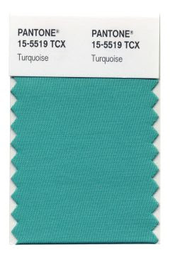
Pantone LLC has just crowned Pantone 15-5519

The color conjures up everything from
the Caribbean Sea

to Southwestern Jewelry

Leatrice Eiseman, executive director of the Pantone Color Institute®, credited its connection to feelings of serenity, protection and luscious escapism.
“Through years of color word-association studies,” she said, “we also find that Turquoise represents an escape to many — taking them to a tropical paradise.”
And who couldn’t use a bit of tropical fantasy these days?
Blue has long been considered America’s favorite color. This Turquoise is one of the brightest, cheeriest shades in the family. The current popularity of zingy colors breaks with the old belief that economically rough times call for soft, neutral hues.
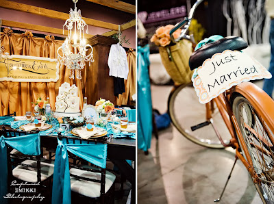
So, the look and feel for Spring/Summer 2010
is bright, bold, and vibrant colors and textures – something we can all look forward to for creative inspiration and dynamic event design solutions!
